Snooze Menu Redesign
The goal of this project is to design a print and app menu to fit a new brand experience for Snooze based on the specific demographics and psychographics of San Francisco while also staying true to the Snooze brand and identity. Snooze is a breakfast and brunch restaurant that has been serving anything from pancakes to breakfast burritos since 2006 in Denver Colorado by two brothers. Jon and Adam Schlegel started Snooze on the idea that the only thing better than a full plate was a conscience and are dedicated to helping the community around each of their restaurants. They do this by donating 1% of their sales back to the community and recycling 90% of their waste. Their goal is to make each morning feel special. Since 2006 they have expanded to 37 locations that are all company-owned. Most of their locations are centralized in Colorado, California, Texas, and Arizona.
Snoozes mission statement is “At Snooze, we believe life is for living and each person and each day is worth celebrating. Our mantra: it only takes a moment to make a difference. Wake up to the potential of your day. Wake up to Snooze!” This should be kept in mind when designing. Snooze’s Their overall business objective is to expand their brand and locations to gain a larger audience. And to accomplish these goals the design should reflect the community while keeping their brand integrity. The design should remind them of home.
The overall target market for this project ranges from anyone 16 to 50 however because San Francisco is growing with a younger population and young families so it would be best to market towards this demographic. The city is made up of mostly white males and females that are working high paying jobs. Almost 50 percent of people living in San Francisco are married and the median income is 112,449 a year. With a total of 362,354 households. San Francisco has many sides to it but two of its main industries are tech and the arts. Both of these play a major role in most of the population’s motivations. Both of these are what makes San Francisco the city that it is.
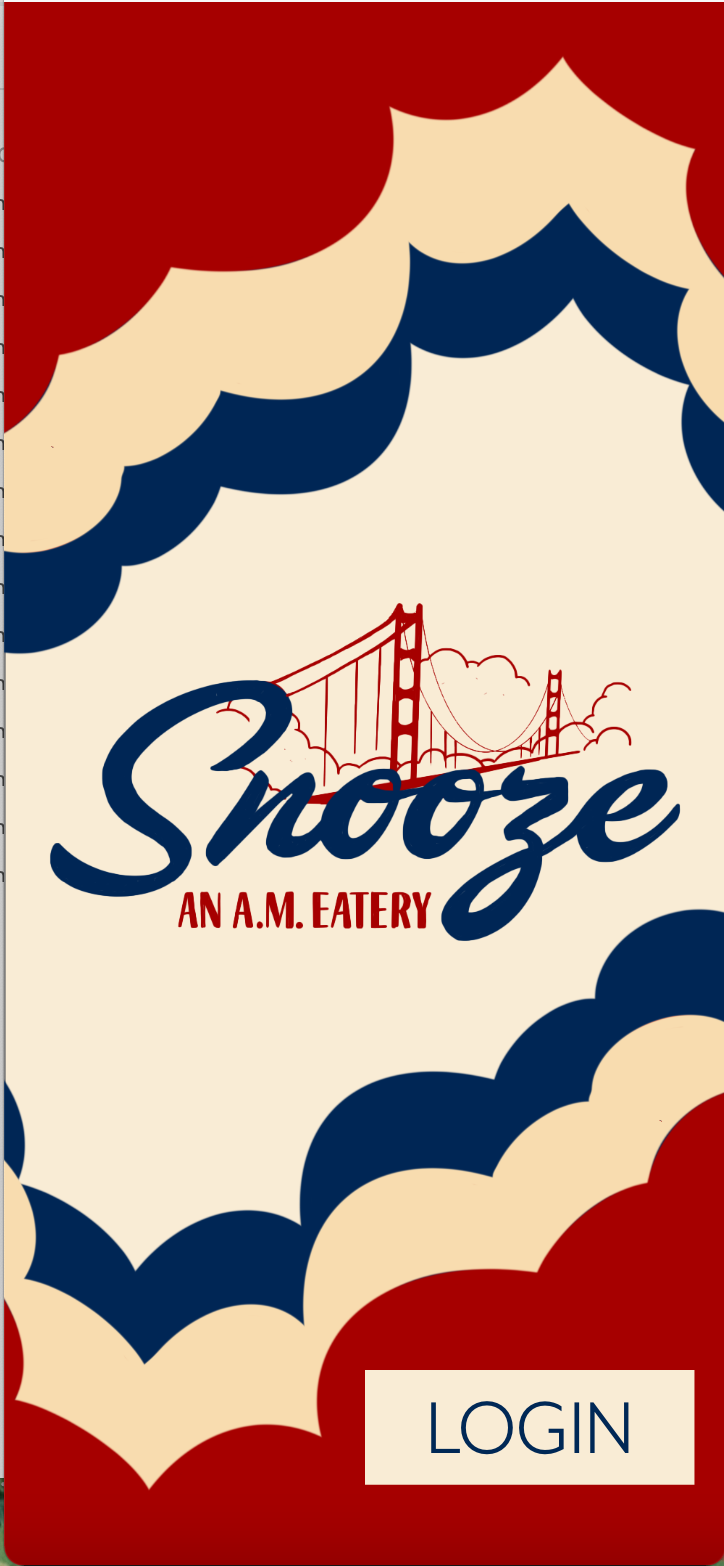
The overall brand attributes for snooze are that they are Lively, Welcoming, Sustainable, Vibrant, and Exciting. With that being said The audience’s overall view of snooze is positive. Snooze prides themselves on having food service, kind staff and welcoming vibes for all of its customers. The goal of this redesign is to keep this image true and further push their brand to the San Francisco audience. With all of this in mind for this project to reflect on one of San Francisco biggest monuments while also incorporating the idea of being up in the clouds since San Fran is built on hills. Since this Snooze is set to be placed in San Francisco the goal was to incorporate places and things that involve the city and for this redesign the center is the Golden Gate Bridge. The typography for this project took inspiration from old diner menus but also from Snoozes logo itself. It includes a script font for the main copy and a san serif for the body copy. The colors used for this redesign are all colors taken directly from a picture of the Golden Gate Bridge. The red represents the bridge, the blue is the water and the cream colors are clouds and sky at sunset. The overall imagery is simple but effective. The goal once again is to make it feel like you are up in the clouds as if you are eating on top of the bridge. The Composition of both the menu and mobile app are meant to be simple and easy to read. The horizontal composition is to create an old diner look.


